Promotion is the other half of self-publishing, and is probably one of the hardest things for me to do. However, graphic design is something I am finding that I am relatively good at doing, so posters and handout cards were the first things I created.
Both the posters and the cards use the cover artwork I created for the story: the description of how that artwork was created can be found here. Clicking the thumbnail images below will display the full-sized image in the browser.
Posters
Unless otherwise noted, the font used here is the straightforward, sans serif font Arial.
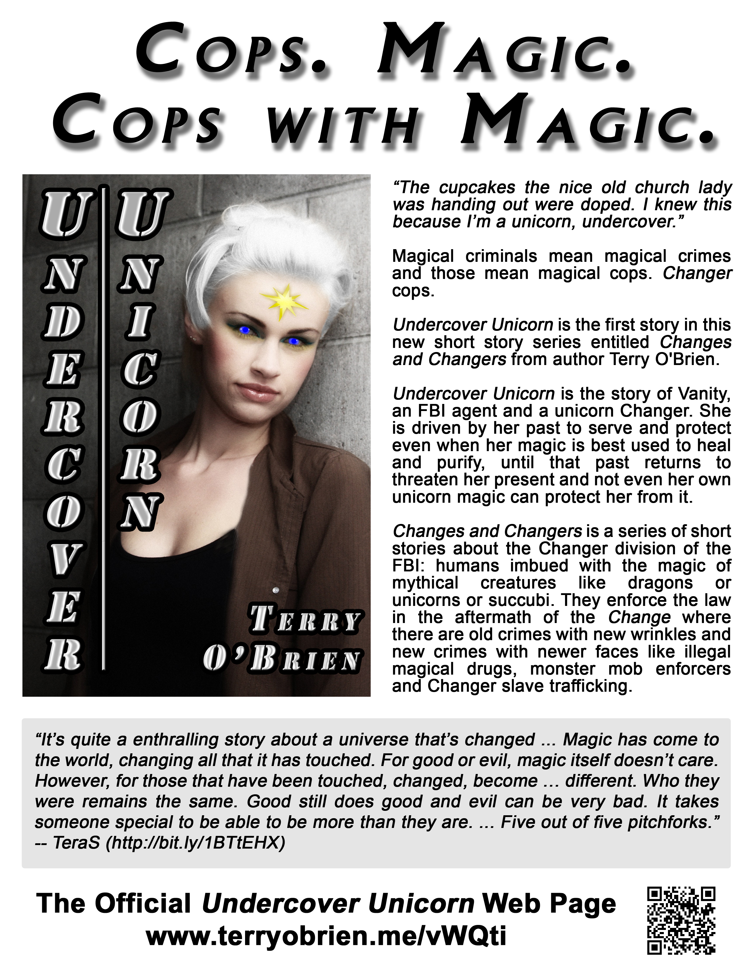
Undercover Unicorn Poster
Title
This title section is primarily the first thing onlookers and potential readers will likely see, other than the cover artwork. Since I control the printing and can print sheets at will, the title is designed to be customized for the situation or event. The title here was intended for a convention where there are a number of fans of police dramas who were also science fiction and fantasy fans.
The font here is Village, which is adapted from the font used for the original television program “The Prisoner”; this particular font is based on the Albertus serif font and can be downloaded here. I chose it for its very strong appearance. I used the drop shadow effect to make the text “pop” from the poster. Depending on the customization of the text, this may also change in the future.
Middle Section
The middle section contains two sub-sections: one for the cover artwork and one for the flavor text.
The cover artwork is on the left, something further to draw attention to the poster. The size of the artwork was adjusted to fit tightly against the side test beside it.
The flavor text on the right is organized into five separately spaced paragraphs: a quote of the first paragraph of the story to catch the attention of the onlooker; a teaser paragraph that ties in with the title to further catch the onlooker’s attention; a paragraph that is an overall introduction the story, the series and the author; a paragraph specifically on the story at hand and a paragraph on the series which includes this story.
Reviews
The review section is used for excepts of the reviews of the story. The words here are quoted and italicized, thereby indicating the words here are not my own. This section is set off from the rest of the poster by the light grey background, further indicating they are quoted: this also breaks up the monotony of the pure white background. This section will have multiple possibilities, again based on the intended audience. The review excerpt shown here is from TeraS, a well-known and enthusiastic collector and promoter of anything and all things related to succubi: her full review can be found here.
Bottom
The bottom section lists the title and the URL of the official page on the website here for the story. Everything up to this point has been about the story itself: now is where I specify where the prospective reader can find out more about the story, especially where to purchase it. I included the QR code graphic of the URL for the convenience of the potential reader: anything that makes it easier for a reader to find and possibly purchase the story is a definite plus here. Also: listing the main page URL drives traffic to the website itself, where the potential readers might be interested in looking over the rest of the website.
I could use this space to list the places which publish this story, but without giving a URL or QR code, the result is still the same: the potential reader would have to go the extra step of looking up the story title on the websites themselves, while the official page has the publisher links to the story conveniently listed. Alternately, I did consider also listing the two major publishers, Amazon and SmashWords, but I could not create an adequate design to implement them along with the information regarding the official web page.
Printing
Posters like this are intended to be displayed at conventions or individual locations like book stores, so therefore only a small number of them would be required at any one time. Therefore, I print these posters myself, because I have sufficient time and resources to do so. Otherwise, it would cost approximately $0.50 per poster to have them duplicated at any office supply or copying store: while the cost then would be relatively small each time I would create a set for a convention, it would accumulate over time.
Notes
A couple of principles I always follow when displaying the posters:
- I always follow the convention or location rules about placing the posters on the walls. Some hotels or venues require special tape and restrict the locations where they can be placed.
- I always fold a strip of tape and mount the poster from the back, not with a strip diagonally across the corners: the latter looks tacky, plus it takes up room where other people would want to place their posters. Besides, it also takes up room on the front side of the poster that can be used more effectively.
- I always use four pieces of tape instead of two at all four corners: that means the poster will not move or fly around because of air motion, especially people walking past it or doors or windows opening and closing. Also, paper has a tendency to curl in high humidity or prolonged hanging, so do this also eliminates that.
- I always use transparent tape (as opposed to masking tape) on the back when placing the posters on windows where they would be back-lit, in order to cut down on the visual distraction of a big brown rectangle showing through the corners. I also use a heavier (24 lb or higher) paper stock in these cases to reduce the paper transparency.

Leave a Reply
You must be logged in to post a comment.