Title and Author Text
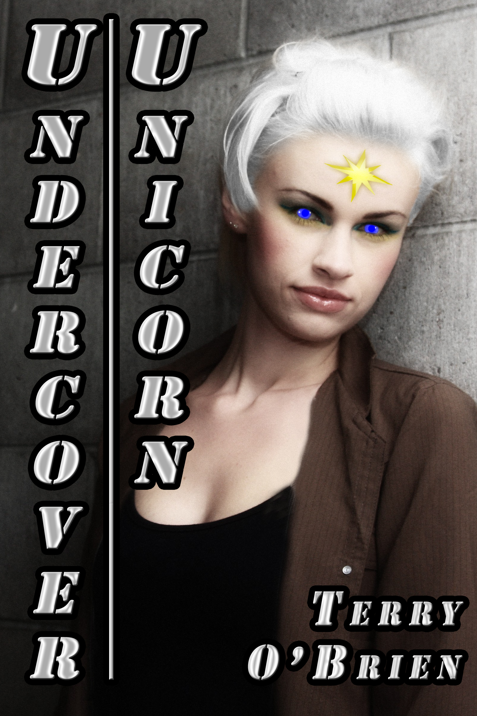 Once everything else was finished, it was time to add the title and author text.As I mentioned in the previous blog post, I changed the name of the story to ‘Undercover Unicorn’ largely so that it would fit better on the cover image. ePublishing does not offer the latitude of large cover images when presenting catalog selections: usually these are limited to a thumbnail (a very good way of describing it) so anything shown on it has to easily seen and read on that small image. The original title of ‘A Unicorn in Disguise’ would not work under these circumstances, hence the title change.
Given the verticality of the standing figure, I decided to run the book title vertical instead of horizontal. The line separating the two lines of text is the second line of text underlined and padded with spaces to the end of the first line. The author name is smaller and run horizontally in the lower right corner: that part wasn’t as important as the title.
The font used is Stencil Std, which I selected for the overall impression of solidity and official-ness which reflects the nature of the character and situation of the story. As usual, I outlined in contrast all of the text in order to make it stand out against any kind of background. I also applied the bevel and emboss bevel style to further enhance it.

Personal Links